Day 3 of our workshop began with our instructor, Fernando Freitas, recommending that we see the nine-part television series called “The Power of Art” which includes an episode focusing on Caravaggio. Our goal is to better understand the life and times of the artist before we attempt to recreate his art.
He also recommended a six-part series from the BBC entitled “The Desperate Romantics“. It features the artists known as the Pre-Raphaelites.
Then, Fernando discussed what type of palettes the Masters used. It’s hard to say whether they used stone, glass, or wood. The one thing the Masters had in common is that they used very few paints on their palettes. The key question every artist must ask themselves is whether the colors will hit the key notes. Think of your palette as your instrument. To be a proficient musician, you must know how to play all the notes on your instrument. The same holds true for artists and their palettes and paints.
Caravaggio used very few oil colors on his palette, perhaps due to scarcity or costs of some of the stone-ground pigments. His paintings were largely painted with darks and lights. With this he could create incredibly dramatic tonal values.
Fernando recommended that, for those interested, it’s best to use a tinted palette. His favorite paper disposable palette is a brand called Grey Matters. It is easy to dispose of a paper palette at the end of the day making cleanup simpler. Personally, I prefer the glass palette I use at home. I painted one side grey so I don’t have a transparency and glare issue. The grey background helps me to better match the color I am trying to achieve. However, after using the disposable paper palette this week, I have to admit it is awfully convenient. But the choice of palette doesn’t make a great artist.
When mixing colors, Fernando suggested that the trick is to mix your colors as if you are a detective analyzing a crime scene. Look for clues in your subject matter to decide which colors to mix together to recreate the color of your subject. Very rarely can you just squeeze the right color out of your paint tube. Is your color dull or bold? Is there a hint of yellow or blue? Always ask whether you need to add a complementary color, or more white for example.
Another important factor is that no two brands of paint are the exact same color. Each uses a different formula. A cadmium paint from one company may look very different from a cadmium paint sold by a competitor. Paints also vary in quality. Some contain a higher percentage of pigments while others use synthetics and fillers. It’s always best, if you are serious about your art, to use a professional grade of oil paint.
Fernando suggested one should first look for the hue, then value and chroma. If you refer back to this principle, it will take a lot of confusion out of the process. As he advised, when mixing your paints, if you “fail to plan, you’d better plan to fail.”
The light in your workspace should be either a perfect Northern light or you should use an artificial light with a color temperature of 5000k. This approximates the ideal sunlight, being neither too blue like 6000k or too yellow like 4,000k or less. Use LED or fluorescent bulbs to achieve the best results. Look for the color rendering index (CRI) of each bulb. The key is to get a bulb with 90% or greater CRI.
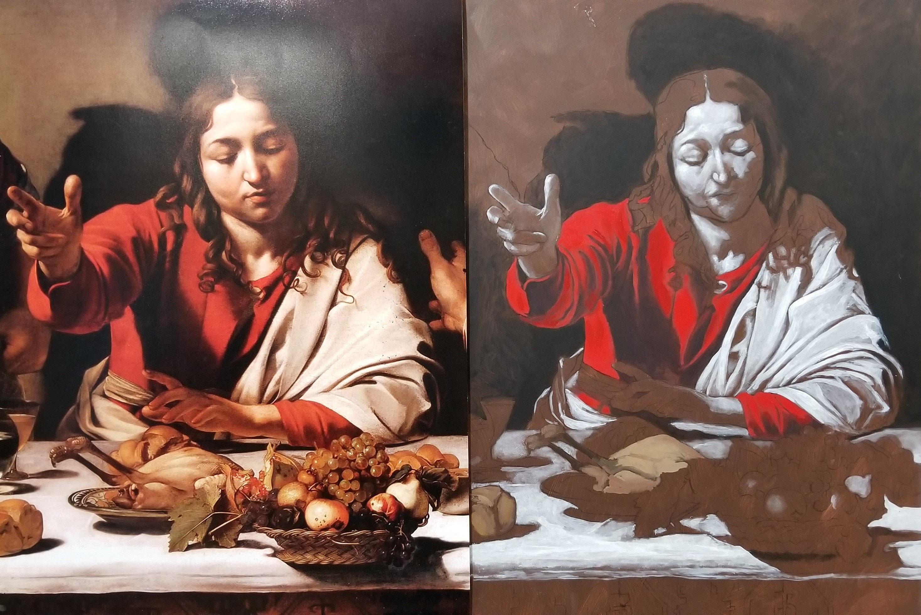
Following the lecture part of our program, we continued working on our paintings by putting the “dead color” on our panels. This stage looks sort of cartoonish to me. The point is to create the perfect hue and value and to simplify the next stage of the painting. This method of painting is very different from the Venetian grisaille underpainting method that I have used in the past . I do find this method somewhat liberating because it allows me to see the whole picture before I work towards the details in the final coat of paint.
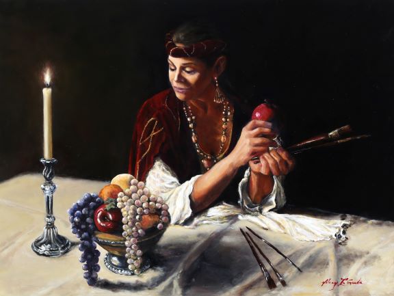
Here’s a picture of the progress I made today.
